We do a lot of self-tracking experiments over here at RescueTime. At any given time, at least one of us is keeping an eye on something. It might be how much time we spend in email, how many lines of code we’ve written, or looking at how much sleep we get each night to see if it has any affect on our productivity.
Sometimes, these metrics can get a little noisy, and it can be difficult to understand if we are trending one way or the other. Here’s a little trick we’ve found that makes your self-tracking numbers easier to understand (and has a nice side-effect of being a great motivational tool).
Keep a running average of your last several measurements.

Yeah, it’s nothing crazy, but it’s easy and totally helpful. Also, if you’re new to self-tracking, it might not be so obvious. Basically, the idea is that a running average of your last 5, 10, or 20 measurements will still be representative of your current progress, but will help smooth out the outliers. Also, if you’re trying to make a change, the running average gives you a daily target to beat (incremental changes are good!).
For instance, I was recovering from an injured foot earlier this year, which caused me to not walk as much as I’d like. I was walking about 4,000 steps per day, and I wanted to get back to around my usual 10,000 steps per day. Rather than push myself too hard and try to make the change all at once, I just focused on trying to beat a 20-day running average. (I had been keeping a log of my steps with my Fitbit for a while.) That ended up slowly getting me back to my goal number of steps in a little over a month. That’s not too long in my opinion, and it was in small, sustainable improvements that I’ve been able to maintain since.

This is the chart I used to track my progress. The grey bars are the steps I took each day. You can see they’re sort of all over the place. The red bar is my 20-day average. And the orange bar is just a reference line to show when I passed the 10,000 steps per day mark.
It turns out, making a chart like this is incredibly easy using any common spreadsheet program. In fact, it’s so simple I find myself making displays like this for pretty much everything from personal self-tracking experiments to analyzing our web site traffic.
Here’s how you do it:
Using your favorite spreadsheet editor, create a new spreadsheet and give it three columns, Date, Value, and Running Average:

Those should be pretty self-explanatory. In the Date column, put the date of your first measurement. If you are starting a new tracking experiment, put today’s date. In the value column, put the value of your first measurement. Go through your data-set and fill out all the values.
Another “Spreadsheets 101” tip: if you have multiple consecutive dates (1/1/2012, 1/2/2012, etc), you can type two dates, then select both spreadsheet cells and drag the bottom-right corner of the cell down to fill out the rest of the cells. This will come in handy when we get to the Running Average.

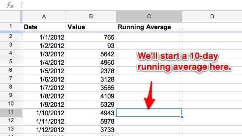
Let’s keep using my example data set of my number of steps while recovering from an injury. After the data is filled out, let’s get the running average calculated. The sheet should look like this:

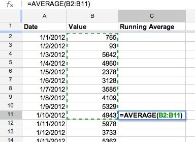
In the Running Average column, you can ignore the first nine rows, since we need ten rows for a 10-day average. (note: you can make your running average be any duration you like. Longer averages create smoother lines, shorter ones are more representative of your most recent measurements) In Row 11, type in: “=AVERGAGE(B2:B11)”

When you click outside that cell (or hit Enter), you’ll see the average of the first ten rows of the Value column.
Now, we can do the same trick we used on the date column. Select the cell and drag downward to calculate the running average for your remaining dates.

That’s it!
At this point, you should have a 10-day average for your entire data set. If you’re using this spreadsheet for an ongoing experiment, you can keep entering in rows of data at the bottom as you collect them.
If there is a meaningful trend, it should be more obvious by looking at the averages than the raw Values. You can take this a step further by plotting this data onto a graph. Using Google Spreadsheets you can do this by selecting Insert > Chart, and then completing the chart wizard.
If you’d like, just open them up and replace the data with your own. But you shouldn’t need to rely on the samples. It really is an incredibly easy technique.
Hat tip to Amelia Greenhall, who I first picked this up from. You can see an excellent video of her using this concept for her own self-tracking experiments here.
But, wait. Shouldn’t RescueTime just do all this stuff for me?
Yes, we’re working on it. We should have something to share with you officially soon. But in the meantime, this is such an easy technique that can be applied to all sorts of self-tracking projects, so we thought we’d share it.
Not tracking anything yet? Here are some ideas:
- Track your time on the computer with RescueTime
(the Pro version gives you easy exports that you can dump right into spreadsheets like this). - Track your steps and sleep time with Fitbit.
- Track your weight
(Any old scale will work. If you want to get fancy you can use a Withings or Fitbit scale to record the data for you). - Track workout times with RunKeeper.

